


My Role: Project Lead + Research + Ideation + UX/UI Design
Project Vision
Standing in long lines at the movie theater for concessions can be a headache. Not only could a moviegoer be running late, but any number of accessibility factors can make the experience a negative one.
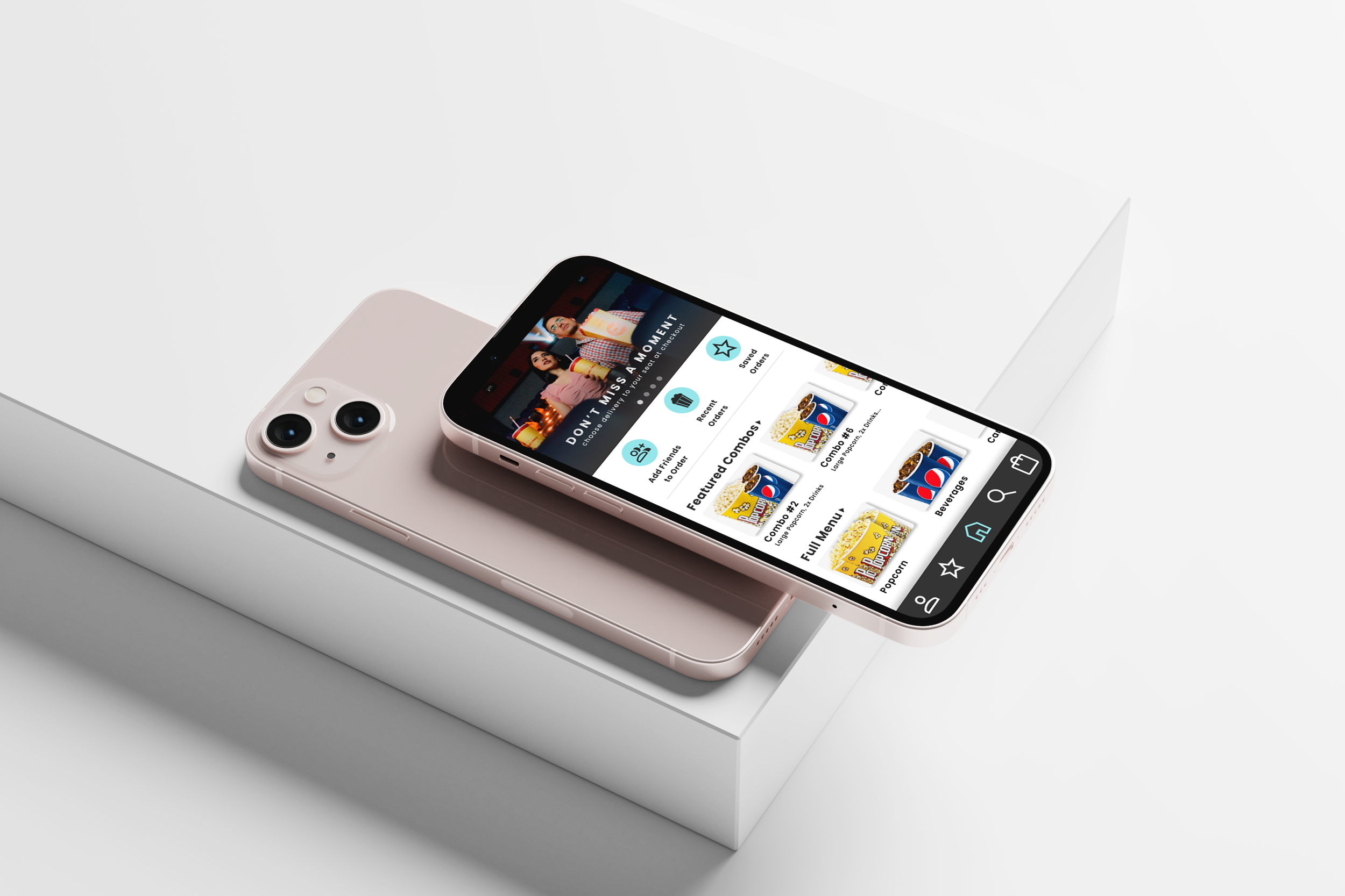
The PopUp App is the answer to those frustrations. Order your snacks ahead and either pick them up or link your tickets to the app to have your food delivered to your seat.
Goals
1 - Create a product that brings genuine value to users.
2 - Build a visually appealing and accessible interface that is easy to use for anyone, no matter their physical abilities.
3 - Provide a quick and simple e-commerce experience.
1. Research
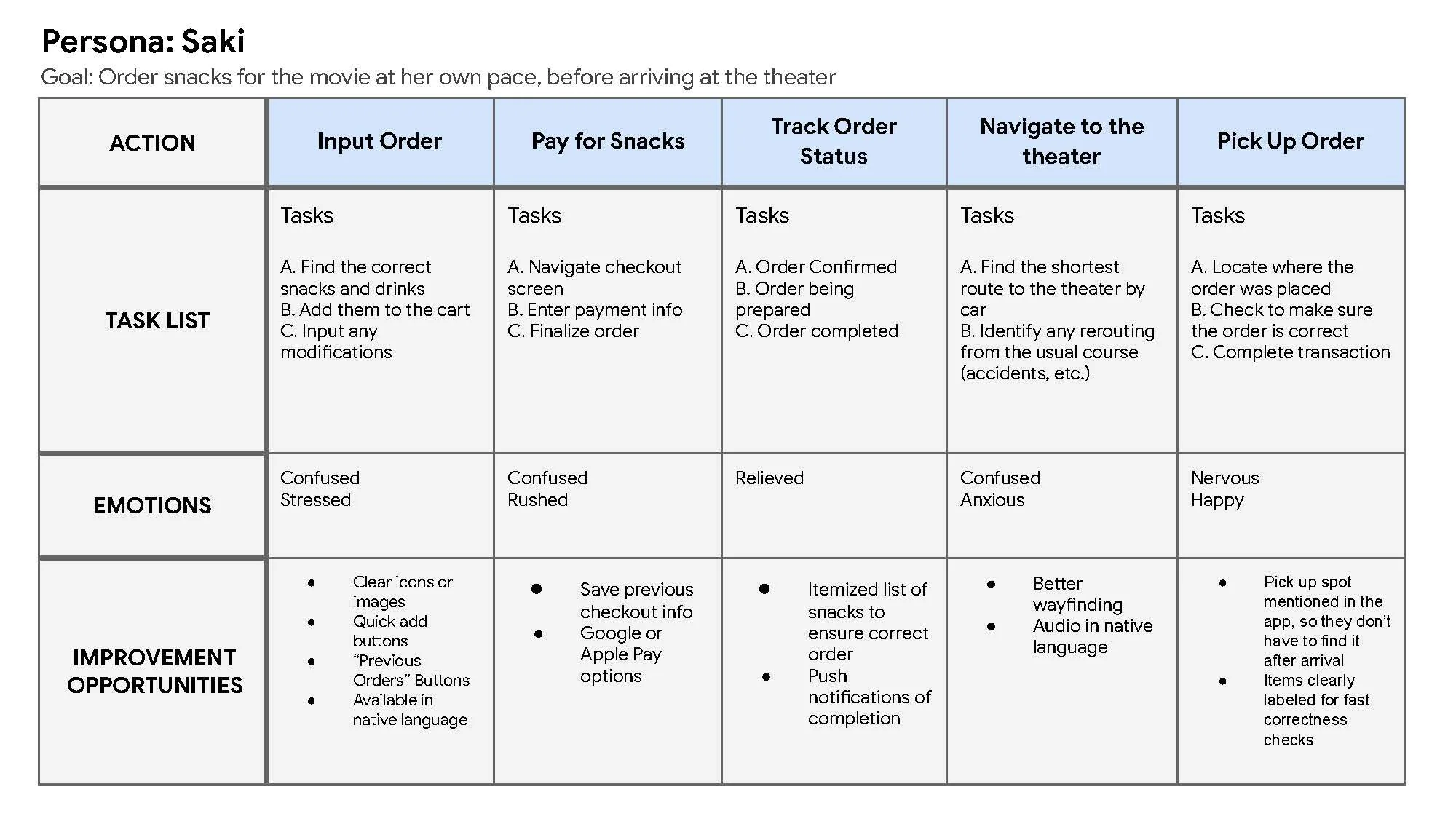
PopUp started with gathering an understanding of potential users through a number of research methods, including personas, user journey maps, and competitive audits.
This research produced two personas that were the basis of the ideation, Saki and Edgar. Saki, a college student who recently moved to the U.S. with her family, gets nervous under stressful situations, as her English language skills are slower than the average moviegoer. Edgar is a very busy executive with a large family that is often short on time due to various responsibilities.


2. Wireframe
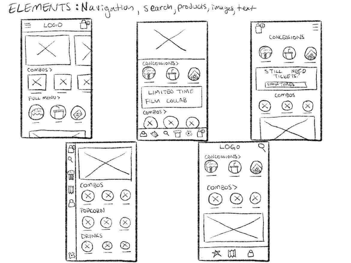
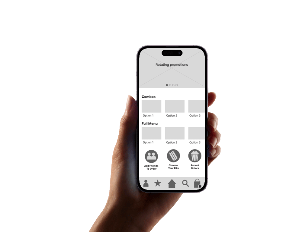
Using this research, I built out the basic format and elements that would make up the app. First, I created storyboards to try and best understand how users may use this app in their everyday life, and the kinds of features they might find important. I then started with hand-drawn wireframes to quickly ideate designs.
I took those drawings and built them out in Figma. Once the digital wireframes were ready, I made them into a prototype that was used in the first round of user testing.


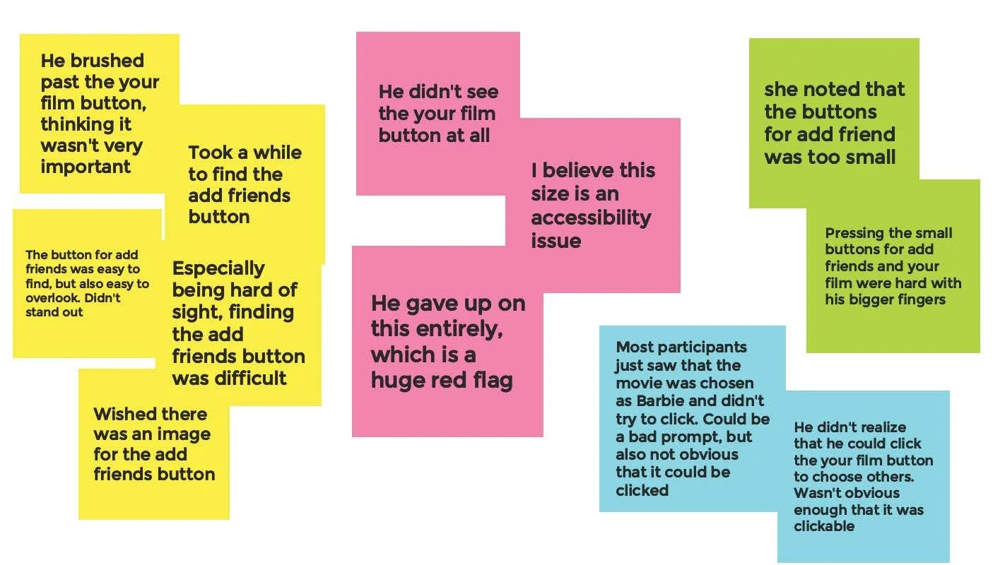
3. User Testing
With the new wireframe prototype, five people entered into an unmoderated user test where they were asked to fulfill tasks and give feedback on their experience. Based on their feedback, I identified themes, created insights, and built an affinity diagram. Based on the feedback, I revised the wireframes and built them out into hi-fi mockups.
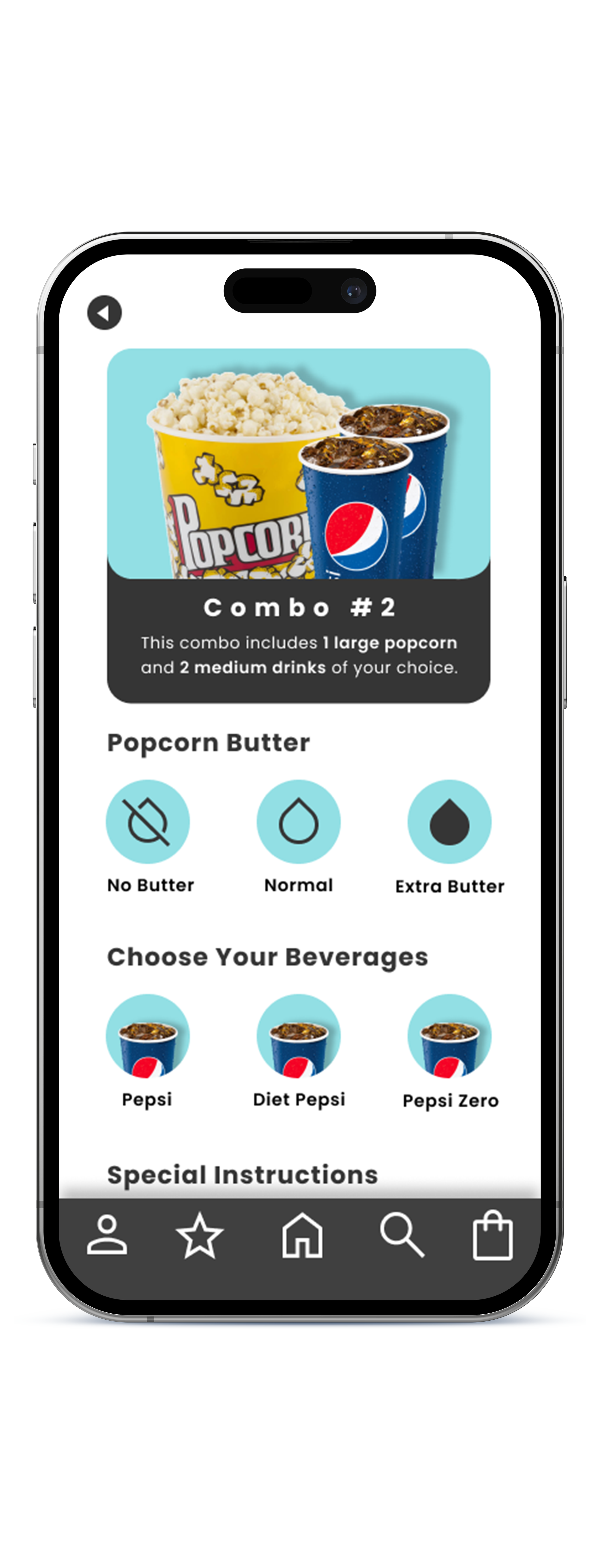
4. Hi-Fi Design
With fresh critique and revised wireframes, the hi-fi design was mocked up. Building out the entire app, I made a new hi-fi prototype for further user testing.


5. User Testing, Round 2
Now that the app had been built into a high-fidelity prototype, testing it again was incredibly important. In order to keep things consistent and see if I’d resolved the issues found in the initial round of testing, the testing was run under the same parameters as before.
6. Updating and Finalizing
The results of the test were great! Not only did it test well, but I was also able to find an element that wasn’t functioning in the user’s best interest, so the functionality of the app became a more seamless experience for the user.
After these changes were made, the app was ready for development!